
For most prints, luster is the safer all-purpose finish. Choose matte instead when glare is your main enemy or you want a gallery-style, nonreflective surface for fine art. Your call also hinges on lighting (bright rooms favor matte) and image type (portraits usually pop more on luster, black-and-white art usually looks richer on matte).
TL;DR:
- Luster paper offers higher contrast and richer highlights, making it suitable for most general prints, especially in well-lit environments or when handling is frequent.
- Matte paper provides no glare and deeper blacks, making it ideal for large-format, gallery displays, and prints placed in bright, glare-prone rooms.
- Testing small proofs under actual lighting conditions is essential to prevent glare issues on large or expensive prints; retries based on real viewing help avoid costly mistakes.
- Portraits and black-and-white images benefit from matte finishes' tonal depth, while landscapes and color-heavy photos usually achieve more punch and separation with luster.
- Smooth, consistent finish choices across multi-piece installations improve visual cohesion in spaces with varying lighting conditions.
Table of Contents
- Matte vs Luster Paper: What Actually Looks Different?
- How Do Lighting and Framing Change the Best Choice?
- Which Finish Fits Each Type of Photo?
- Photo Lab vs Fine Art Printing: What Changes on Paper?
- How Should You Test Paper Before Printing Large?
- What Facilityart Has Learned From Multi-Piece Installs
- The One Rule Worth Remembering
- Where to Learn More About Paper Finishes
- Sources
- FAQ
Matte vs Luster Paper: What Actually Looks Different?
The two finishes separate on five things you can see and feel the moment a print comes out of the box: sheen, texture, color punch, sharpness, and how well they survive handling.
Luster (sometimes labeled satin or pearl) has a semi-gloss surface with a faint, pebbled texture, often called an "orange-peel" pattern. That micro-texture scatters light instead of bouncing it straight back at you, which keeps color vibrancy and contrast high while cutting down glare compared to true glossy stock. Matte, by contrast, is flat and non-reflective. It has almost no sheen at all, and its surface eliminates glare entirely, which makes it easier to view from wide angles without catching a window reflection.
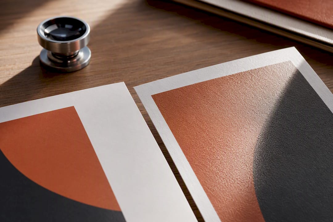
That texture difference changes how the eye reads sharpness. Luster's slight sheen makes fine detail look crisp and gives highlights a bit of sparkle. Matte softens that edge slightly. It doesn't lose detail, but the flat surface reads as calmer and more painterly, which is exactly why it's the default for fine art reproduction.
Here's the quick breakdown:
- Luster: Higher perceived contrast, richer highlight detail, fingerprint-resistant surface, works well under most home and gallery lighting.
- Matte: Zero glare, deeper black tones from extra ink absorption, slightly muted overall saturation, comfortable viewing from nearly any angle.
- Handling: Both finishes hide fingerprints far better than high-gloss paper, since luster's fine texture masks smudges and matte's flat surface doesn't show oils the way a shiny coating does.
Neither finish is "better" in a vacuum. They just solve different problems, and the next section is where that starts to matter.
How Do Lighting and Framing Change the Best Choice?
Your walls decide more of this than your printer does. A print's finish behaves differently depending on where it hangs and what light hits it.
- Bright rooms with direct light: Matte wins here every time. A print hung opposite a window, under track lighting, or in a hallway with skylights will show every reflection on a glossy or luster surface. Matte's flat finish stays readable from any seat in the room.
- Controlled, even lighting: Luster performs beautifully when there's no direct glare source, like a hallway with diffused overhead lighting or a room without harsh window exposure. You get the contrast boost without the reflection headache.
- Framed behind glass: If you're framing under standard glass, matte paper plus anti-glare glazing is close to bulletproof against reflections. Luster behind museum-grade non-reflective glass also works fine, since the glazing does most of the glare-fighting for you.
- Large-format prints: Sheen becomes more noticeable as prints get bigger, since more surface area means more opportunity to catch light at an angle. On oversized prints, matte's forgiving nature becomes a bigger advantage.
Pro Tip: Before you commit to a large or expensive print, hang a small proof in the exact spot it'll live for a day. Light shifts from morning to evening, and a finish that looks great at noon can glare badly at 5 PM.
Which Finish Fits Each Type of Photo?
Matching finish to image type is where most of the real decision-making happens, and the right call changes depending on what's actually in the frame.
- Portraits and wedding photography: Luster is the default for a reason. It gives skin tones warmth and depth without the harsh specular highlights of glossy paper, and its texture resists fingerprints during handling and passing prints around at a family gathering. Switch to matte only if the final piece will hang in a bright, glare-heavy spot or behind non-anti-glare glass.
- Black-and-white and fine art: Matte usually wins. Extra ink absorption on matte stock deepens blacks and gives monochrome prints a richer, more tonal look, which is part of why matte and fine-art rag papers dominate gallery walls.
- Landscapes and color-heavy images: Luster typically delivers more punch and separation between color bands, unless the print will hang somewhere glare-prone, in which case matte's readability wins out.
- Albums and frequently handled prints: Skip high-gloss altogether. Both matte and luster resist fingerprints far better, and for albums that get flipped through often, that durability matters more than a marginal contrast boost.
- Event prints and quick turnarounds: Luster is the practical choice for prints changing hands often at parties or galas, since it survives casual handling without showing smudges the way gloss does.
Photo Lab vs Fine Art Printing: What Changes on Paper?
The finish conversation splits into two separate worlds depending on how the print is made. Standard photo labs use resin-coated (RC) papers, which typically come in glossy, luster, and matte RC options, all built for fast turnaround and everyday durability.
Giclée printing is a different process entirely. It uses pigment-based inks on cotton rag or alpha-cellulose fine-art papers, and it's the standard for archival fine art reproduction, museum pieces, and limited-edition prints. That's the core difference behind the giclée vs photo print question: one is optimized for speed and everyday use, the other for longevity and gallery presentation.
Matte's higher ink absorption plays out differently depending on which process you're using:
- On RC matte paper, blacks deepen slightly, but overall saturation can look a touch more muted than luster.
- On giclée matte or baryta stock, that same ink absorption produces a richer, almost painterly depth that collectors specifically seek out.
- Archival considerations favor acid-free, cotton rag, or baryta papers printed with pigment inks, which resist fading far longer than standard RC stock under normal indoor lighting.
- Care basics stay simple either way: keep prints out of direct sun and high humidity, and handle framed pieces by the edges, not the glass.
How Should You Test Paper Before Printing Large?
Never commit to a big or expensive print run based on a screen preview. Order small proofs first.
- Request sample prints of the same image on both matte and luster from the same paper family and printer, so you're comparing finish, not print quality drift.
- View both proofs under the actual lighting the final print will live in, not your desk lamp or a phone screen.
- Compare how each handles highlights, deep shadows, and midtone gradients side by side.
- Check for glare by tilting each proof at the angle you'll typically view it from, whether that's walking past a hallway or sitting across a living room.
- Look closely for fingerprints and scuff resistance if the print will be handled at all, like album pages or gift prints passed around a table.
Testing proofs under real viewing conditions before a full run is standard advice for a reason: it's the only way to catch a bad finish choice before you've paid for a dozen large prints.
Pro Tip: Ask your print lab for the paper's spec sheet and save the sample ID number. Reordering the exact same stock two years later is much easier when you're not guessing which "satin" they meant.
What Facilityart Has Learned From Multi-Piece Installs
Choosing one finish for a single print is simple. Choosing finishes across a whole lobby, corridor, or amenity space is a different puzzle, since lighting rarely stays consistent from one wall to the next.
Consistent finish choice across a collection reduces perceptual mismatch when lighting varies from one hallway to the next. A piece that looks rich under a skylight can go flat and glary three doors down under fluorescent panels, so the finish decision has to account for the whole space, not just one wall.
That's why Facilityart leans toward matte or low-sheen luster for shared spaces that see a lot of foot traffic and touch. Durability matters as much as color richness in a lobby, and a consistent finish keeps a multi-piece collection reading as one cohesive installation rather than a mismatched gallery wall. For multi-property installations, proofing includes scaled sample placements in each typical lighting condition before a full order goes out.
The One Rule Worth Remembering
If you only remember one thing, make it this: luster is the versatile default, and matte is the tool you reach for the moment glare becomes the enemy or you want that gallery, nonreflective look. Every other decision, from image type to framing, is a variation on that one trade-off. Order a proof before you print big. Your eyes will settle the argument faster than any spec sheet.
— Mat
Where to Learn More About Paper Finishes
For deeper technical specs, check manufacturer guides like PermaJet's gloss vs matte vs satin breakdown or Canson Infinity's satin vs matte guidance. Most labs also sell small proof kits for testing before a full run.
Sources
- Difference between luster/lustre and glossy inkjet paper surfaces | Red River Paper
- Matte paper explained | Printing Partners
- Best paper for photography prints | Paper-Direct
- Giclée vs Photo Prints | The Stack House
FAQ
What Is Better, Matte or Luster?
Neither wins outright. Luster suits most general photo printing thanks to its color punch and glare resistance, while matte is better when a room has heavy glare or the print needs a fine-art, nonreflective look.
Is Luster the Same as Matte?
No. Luster has a semi-gloss surface with a fine texture that adds sheen and contrast, while matte is flat and completely non-reflective, producing a softer, more muted look.
Do Professional Photographers Use Matte or Glossy?
Most professional labs default to luster (satin) rather than true glossy, since it offers color richness without harsh reflections, making it a common choice for client portfolios and framed work. Matte gets used for fine art, black-and-white work, and gallery pieces.
Is Luster Paper Worth It?
Yes, for most everyday prints. Its balance of contrast, color, and fingerprint resistance makes it a dependable general-purpose choice, and it's often cited as the recommended default for home and portfolio printing.